
Our team created a simplified and combined money movement experience for Finastra’s mobile banking applications in order to reduce redundancies, improve task completion time and modernize the existing UI.


Overview: Our team redesigned the Move Money experience for Finastra’s mobile banking applications to reduce redundancies, improve task completion time, and modernize the user interface. This work was part of Phase Two of Finastra’s digital banking overhaul, following the successful redesign of the dashboard and accounts views.
Duration: 6 months
Team: Senior UX Designer (myself), Mid-level UX Designer/Researcher, Junior UX Designer
My Role: As Senior UX Designer, I co-defined project goals with Product and Management, conducted user research and testing, led design reviews, and facilitated bi-weekly progress sessions. I also presented findings and recommendations to leadership throughout the project.
Objectives: Our goal was to design a simplified, intuitive layout that combined and streamlined multiple money movement workflows. Specifically, we aimed to:
Reduce redundant features and extra clicks
Improve task completion speed for internal and external transfers
Introduce Quick Transfers for faster interactions
Modernize the UI to align with the new design system
Minimize implementation time while improving overall performance
By achieving these goals, we sought to differentiate Finastra’s mobile app from competitors in the money movement space.
Project phases: Project Goals → Competitive Research → Personas → Sketches & Wireframes → Analysis → Hi-Fi Prototypes → User Testing → Iterations → Dev Handoff

Competitive Analysis: We evaluated leading peer-to-peer and banking transfer experiences including Venmo, Zelle, Cash App, Google Pay, PayPal, Bank of America, Wells Fargo, USAA, and Capital One.Analytics: After completing the competitor research, the next step was to take this data and combine it with findings from our own internal analytics tool. Our main goal here was to dig deeper into customer usage.
Our focus was to identify:
Common user flows and micro-interactions
Strengths in clarity, speed, and discoverability
Modern design patterns in transfer workflows
We then combined competitive insights with internal analytics to better understand customer usage patterns:
Which money movement features were used most often?
How many distinct transfer options did users have?
How frequently were internal vs. external transfers initiated?
Where did users experience friction or confusion?
These insights informed our feature prioritization and guided early design decisions.
Personas: Using our research and analytics findings, we developed three representative personas that captured varying user goals and pain points. These personas helped us focus on key use cases—such as frequent internal transfers and first-time external payments—and validate design decisions throughout
Name
Age
Archetype
Main goals
Touch Points
Pain Points


Design Process:
I began by sketching out multiple versions of the Move Money landing screen, exploring different ways to combine redundant transfer types and simplify navigation.
Because users’ primary goal was to make a quick internal transfer, I prioritized designs that provided shortcuts and clear entry points for common actions.
These sketches evolved into low-fidelity wireframes in Adobe XD, which we used to share early concepts with stakeholders and align on direction.
The main purpose of my sketches were to brainstorm initial ideas for the consolidated move money landing screen and to quickly share designs with the team.
Since the user's main goal is to make an internal transfer as quickly as possible, I used sketches to come up with ideas to provide convenient shortcuts.
In this round of sketches, I was exploring differences to the top widget card on the money movement dashboard as well as the idea of a Quick Transfer.
These quick sketches helped me visualize and communicate the different landing screen options with other team members and stakeholders and helped dictate which versions we moved forward with for prototyping and user testing.
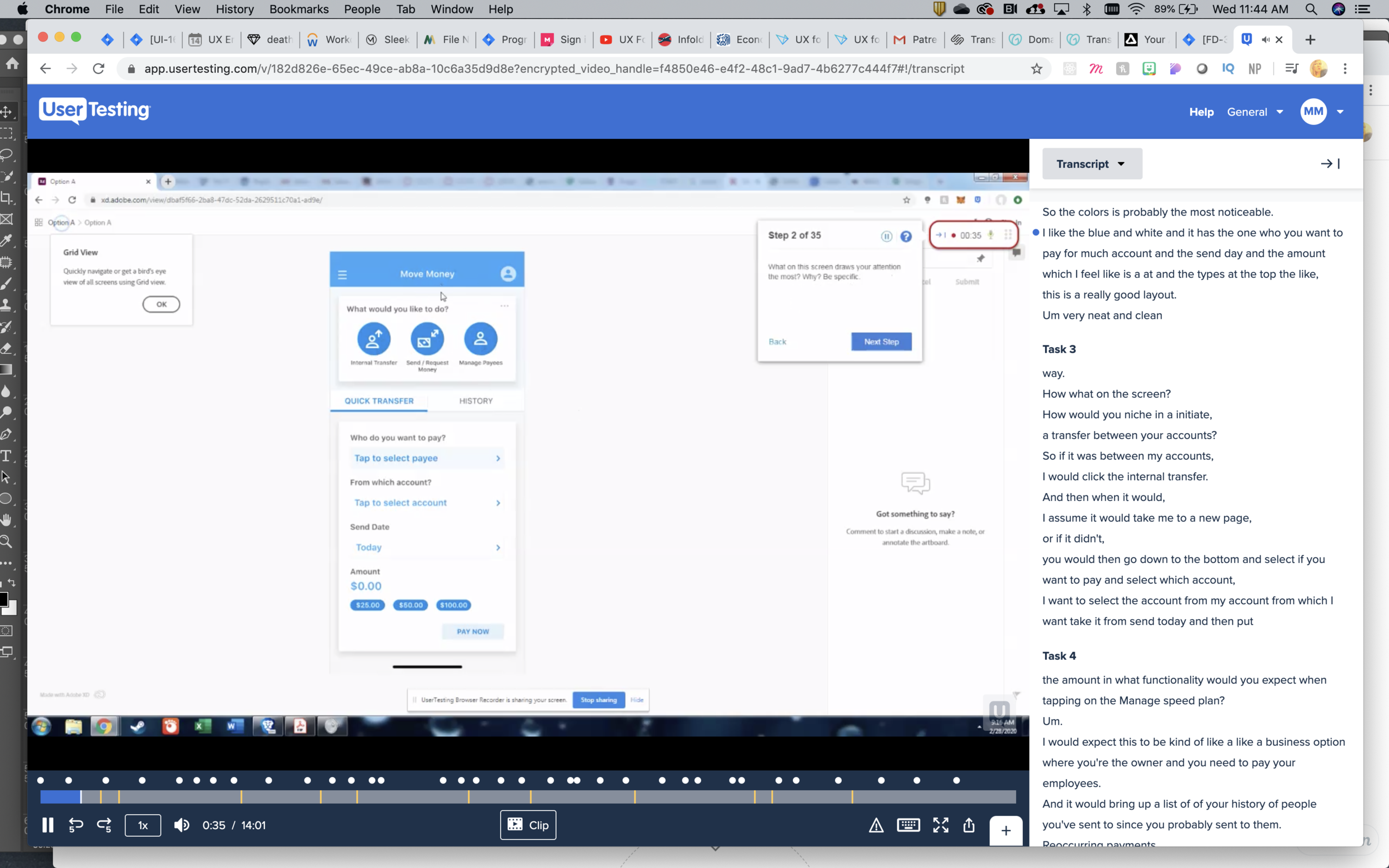
User Testing: I collaborated with another UX Designer to conduct two rounds of user testing.
Round 1:
10 unmoderated A/B tests via UserTesting.com
iPhone prototypes of three layout options (A, B, and C)
Tasks focused on discovering, initiating, and completing transfers
Findings:
Users found Option C (with transaction history on the main screen) unnecessary
Options A and B performed better, but each had strengths worth merging
Round 2:
We combined the best elements of A and B and ran a second test. The final hybrid layout clearly outperformed the others, with improved task completion time and better perceived simplicity.

Final Designs: The final Move Money experience consolidated redundant transfer options into one intuitive flow, introduced Quick Transfers, and adopted a refreshed UI consistent with the updated dashboard and accounts views.
Final iPhone Prototype
Move Money Findings
Key Improvements:
30% reduction in average clicks per task (internal testing)
Clearer navigation between internal and external transfers
More modern and consistent UI patterns