
In order to improve the load time of the initial experience and provide added functionality, our team created an enhanced post-login dashboard view for Finastra’s mobile banking application.
Overview: To improve load time and enhance functionality, our team designed a new post-login dashboard for Finastra’s mobile banking app. This effort was part of a larger UX and UI refresh across Finastra’s digital banking suite—spanning iOS, Android, and web applications.
Duration: 6 months from conception to production
Team: Senior UX Designer (myself), Mid-level UX Designer/Researcher, Junior UX Designer
My Role: As the Senior UX Designer, I co-defined project objectives with Product, led user research and testing, and guided the design direction throughout the process.
Product context: Finastra’s UXE team builds robust, customizable mobile and web banking applications for financial institutions across North America. Each institution can tailor colors, icons, imagery, and features to match their brand identity.
Today, over 400 financial institutions use Finastra’s platform, serving more than 1 million end users.


The Challenge: The existing post-login experience loaded all account and transaction data simultaneously, resulting in slow load times, especially for users with multiple accounts.
Additionally:
Navigating between accounts required excessive scrolling
Selected/unselected states relied solely on color—an accessibility concern
Transaction details required expanding each row individually
Problem statement: "Our first experience for mobile users is slow and is not intuitive for users who have more than one bank account."
Design question: "How might we help mobile users with more than one bank account quickly view transactions and easily navigate between accounts?"
Research: We analyzed leading financial technology platforms and major banks to benchmark UX patterns and identify gaps. We evaluated each against 20 categories including UI design, key features, app ratings, and customization options.
Key Insight: Most competitors offered a dashboard-style landing experience with customizable widgets and quick actions—an area where Finastra lagged behind.
Using internal analytics, we explored:
Which features users engaged with most frequently
Average number of accounts per user
Login frequency and primary session goals (e.g., checking balances)
Personas: Based on research and analytics, we developed three personas representing key user segments. These guided design decisions throughout the process, ensuring we met diverse user needs.
Name
Age
Archetype
Main goals
Touch Points
Pain Points

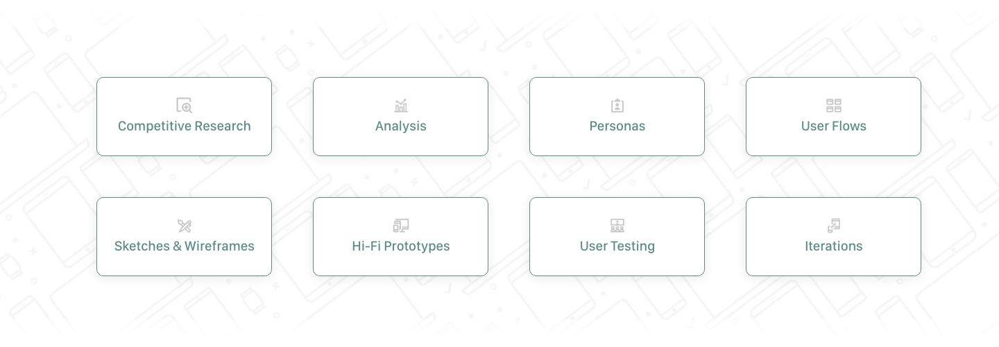
Design process: I began with low-fidelity sketches to explore multiple dashboard layouts and account views. These allowed for quick iteration and team collaboration before moving into digital wireframes in Adobe XD.
The focus: fast access to balances and simplified navigation. Early sketches explored widget placement, account summaries, and balance visibility, helping us align on a direction before prototyping.
The main purpose of my sketches were to brainstorm initial ideas for the dashboard interface and new accounts views and to quickly share designs with the team.
Since the user's main goal is to check their balance quickly upon login, I used sketches to come up with ideas to provide convenient shortcuts.
I went through several versions of sketches before moving on to wireframes in XD.
In this round of sketches, I was exploring differences to the top widget card on the money movement dashboard.
These quick sketches helped me visualize and communicate the different dashboard flows with other team members and stakeholders and helped dictate which versions we moved forward with for prototyping and user testing.

User Testing: We conducted moderated sessions with 10 participants via UserTesting.com to evaluate two dashboard layouts:


Version A – Swipe Navigation:
Pros: Dedicated pages for accounts and widgets
Cons: 4 of 10 users never discovered the additional views; low discoverability of page indicators
Version B – Vertical Scroll:
Pros: Fully discoverable; intuitive scrolling behavior; all users found the content easily
Cons: Some users disliked seeing net worth on the first screen; preferred to hide this widget
Outcomes: Version B performed best overall, leading to further refinements around widget customization and account card layouts.
Final Designs: The final dashboard improved both usability and performance, with a modular layout supporting:
Quick account access
Customizable widgets
Marketing messages and alerts
Faster load times


Final iPhone Prototype
Results: We beta-tested the redesign with two financial institutions. Both are now live in production.
One bank achieved 12K app downloads and a 4.6 App Store rating
Users reported faster load times, fewer support calls, and reduced complaints
Business impact: 20 new financial institutions contracted for the new version
Next Steps:
Conduct follow-up testing with users of both app versions
Expand widget offerings and placement options
Continue enhancing UX/UI across money movement and other key workflows